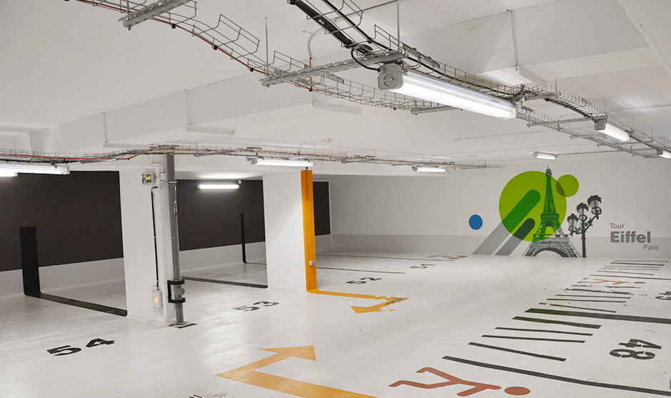
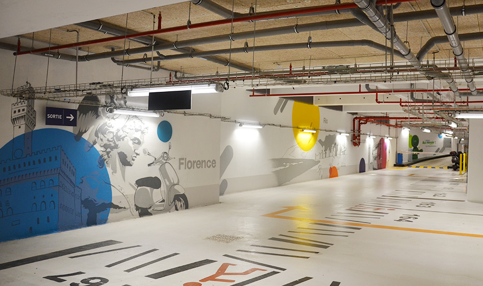
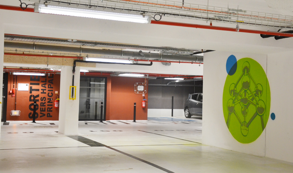
Company parking lots are often the same: ugly neon lights, ugly bands of color… Absolutely boring. But some people are not short on ideas and have taken the brilliant initiative of approaching us to dress up some of the walls of a famous company’s parking lot in the west of Paris.
More than graffiti graphic parking lot design as such
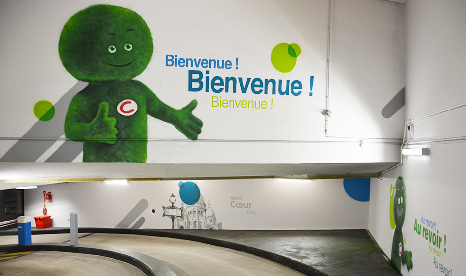
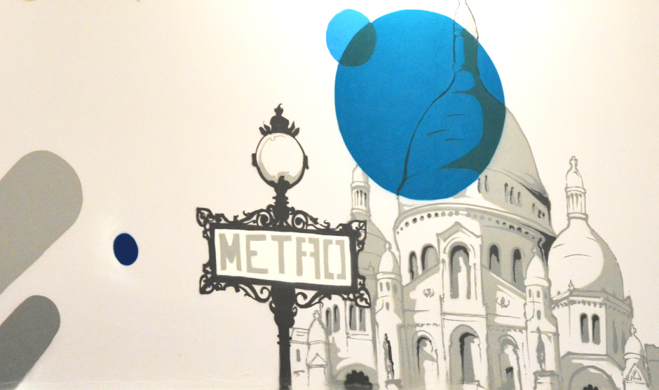
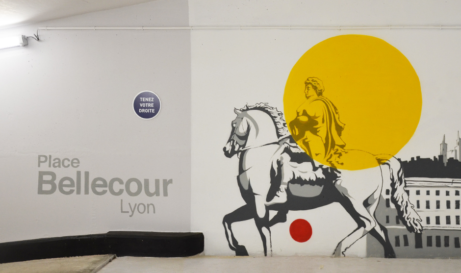
We will talk here more about spray paint rather than graffiti, considering all the constraints related to the realization of such a project. Indeed, whether in terms of graphic mood, colors or shapes, all the elements that made up the frescoes had to fit into Cetelem’s graphic charter.
This type of formula is certainly quite constraining from a creative point of view, but it guarantees consistency throughout the building, coming across as a nice « finishing touch » for visitors, many of whom arrive via the parking lot. As soon as they arrive, they find themselves immersed in the universe of the brand in question and a context that is much less austere than a standard parking lot.
Mascot and trip to the big capitals
The client has chosen to take the visitor on a journey through the major capitals of the world where he is present. From one painting to the next, you change continents, atmospheres, monuments or other cultural references… The little green character who embodies Cetelem in all communication media is not to be outdone, as he has been placed in strategic locations: he is the one who greets visitors when they enter the car park. And it is also he who greets them when they follow the path to the exit. A beautiful example of an original and colorful company car park that could inspire more than one !



Related Posts
22 décembre 2019
Graffiti In malls: the virgin Megastore in Dubai mall
Some people may find it a bad idea to…
