What does an article on the subject of fashion illustration have to do with this website ? Well, first of all we do what we want because we’re on our blog! Moreover, we’re interested here in all areas of design, whatever they are. As soon as one or more human beings show creativity, we might be interested.
Fashion illustration finesse
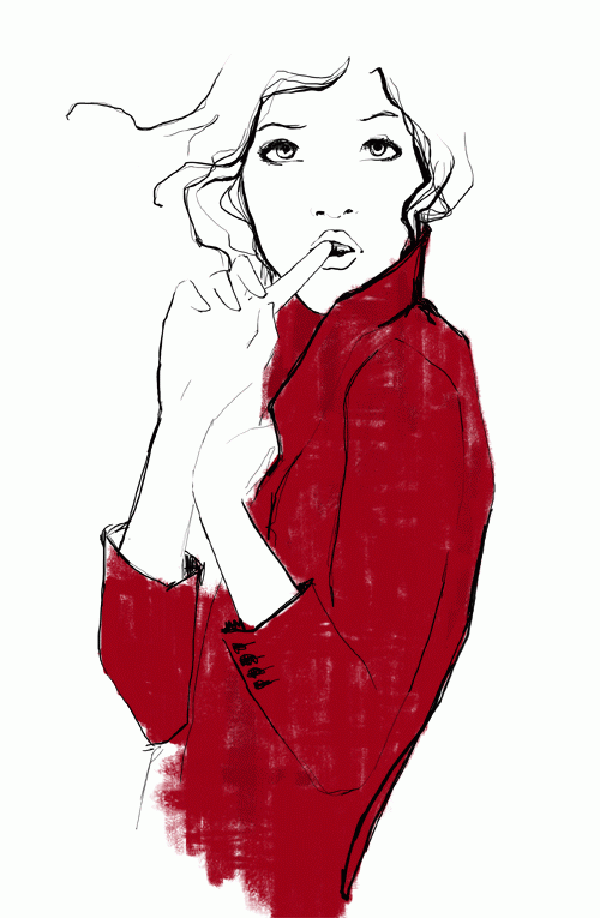
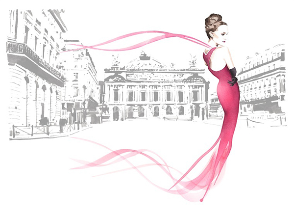
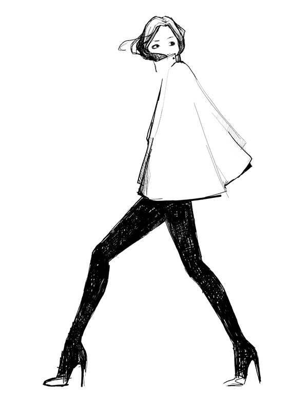
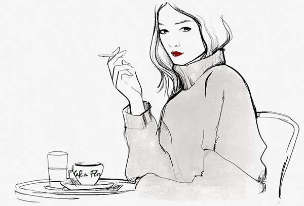
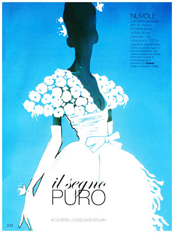
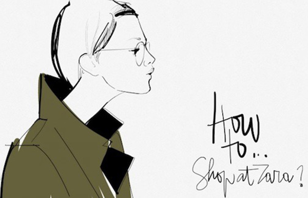
We have always tried to avoid « too much » or « bad taste » in our productions. We finally have a rather minimalist approach, if only in the number of colors to be used. Indeed, one could almost say that in our opinion, the fewer colors, the better we look. In fact, the form « Black and white + one color » is a formula that we know well. Moreover, the clear line is often what makes the strength of this kind of illustrations. The background is often white. The line is often black.
A flexible and aerial line
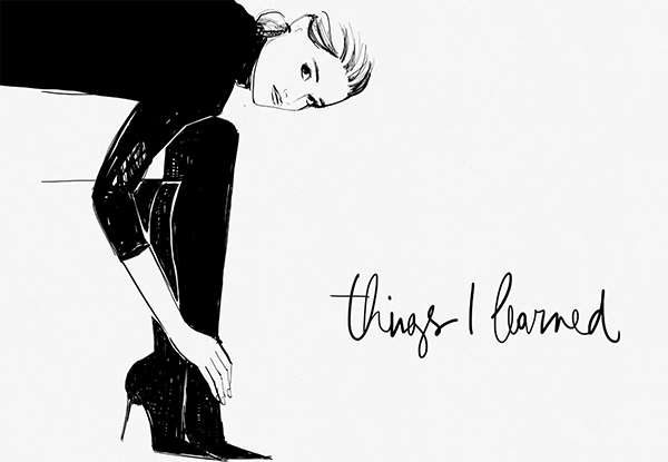
Whether in this type of illustration as in the art of calligraphy for example, there is no need to overdo it. Everything is revealed in line flexibility and precision. Indeed, it is the line that brings the whole personality to the drawing, that creates rhythm and balance. It can also be combined with a bright color. The contribution of textures brings even more charm and richness to the final composition.
There are many illustrators (and especially illustrators) in the field that we could advise you. This will most certainly be the subject of a future article. In the meantime, we strongly invite you to discover the work of Garance Doré, to whom we are very sensitive here.
